Turbocharge your mobile game creation
Take your game development to a whole new level inside the Homa Academy. With access to our extensive library of mobile game developer resources, you'll discover practical, actionable training and resources on how to design creative, powerful games.
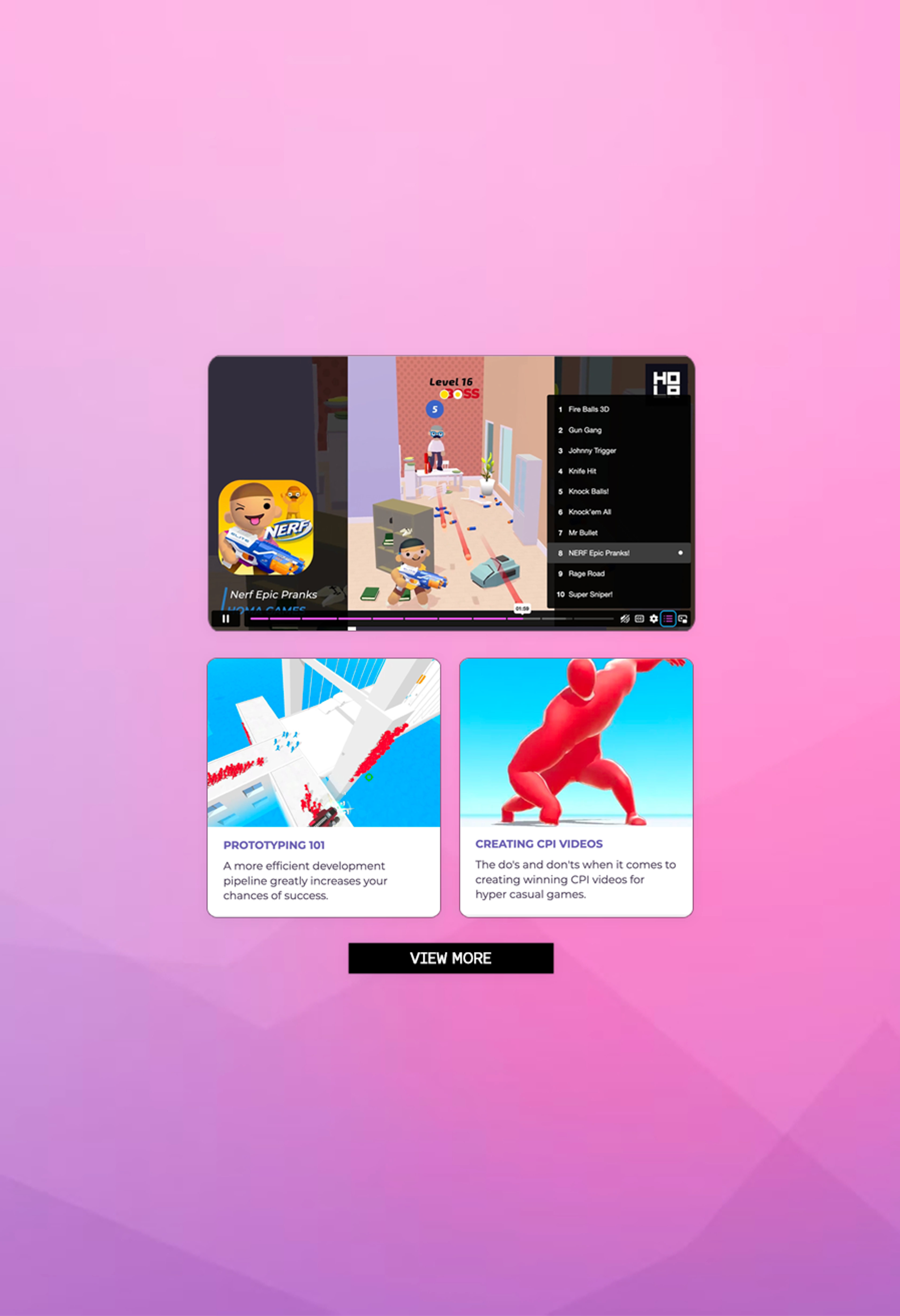
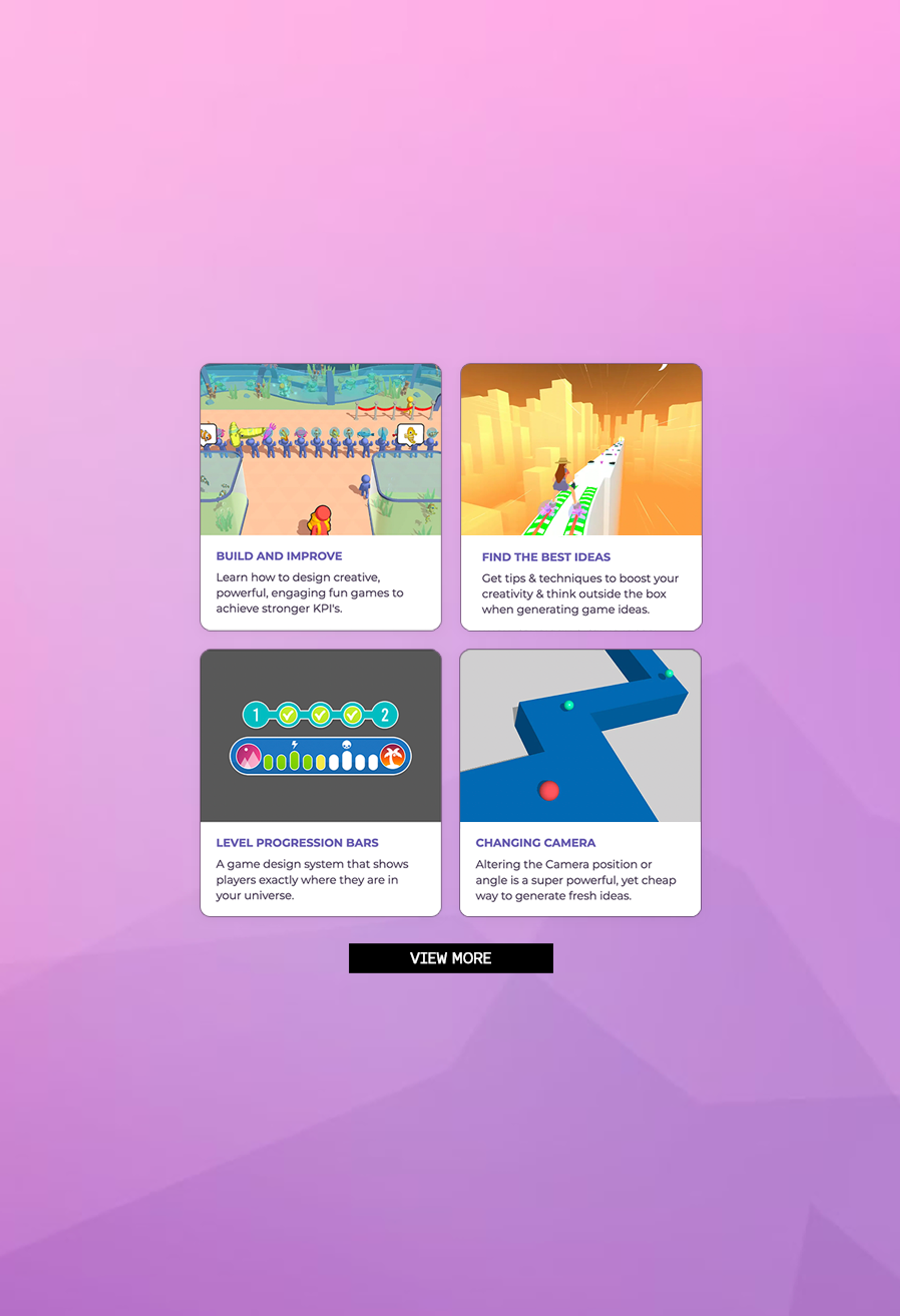
Here’s just some of the ways the Homa Academy can help you…
Transform yourself into a mobile game ideation machine
Never feel stuck for a game idea again as you'll learn all the tips & techniques to boost your creativity to start generating exciting new game ideas.
Keep ahead of latest trends in mobile gaming
Ensure you're always one step ahead of the market with our weekly content updates and live Q&A sessions. We're here to answer your questions fast.
Master Powerful Game Design Techniques
Through our vast library of game design tutorials, you'll learn the proven foundational elements to create incredibly satisfying player experiences.
Discover the key metrics that you need to track
Understand all the data points you need to know when building, testing and iterating on your prototypes to maximise success.
Understand the mobile games market
Deep insights on how the mobile industry works along with the support you need to navigate the fast moving mobile landscape.
Keep Focussed & Stop Wasting Time
Put your time, energy and resources in the right places. We're here to support, advise and guide you every step of the way.
Immerse yourself in the world of mobile game development
With a deep focus on game ideation and creative inspiration, you'll discover all the resources you need to transform yourself into a game idea wizard!
Resources for all game genres, mechanics and control systems to ensure you understand what works and what doesn’t.
We do your homework for you
Weekly game ideation and live Q&A
Game ideation can be a daunting process. It's one of the most important stages of game development as it lays the groundwork for the creation of successful and engaging games.
Each week inside the Academy, you'll have access to a host of experts to discuss fresh ideas and get feedback. We believe that identifying factors such as marketability, feasibility and uniqueness you'll create games that will stand out in a crowded market.